GOYA AND WITCHES


I have managed to resist a trip to London to view the latest batch of blockbuster exhibitions but not the buying of the catalogue for the exhibition The Witches and Old Women Album by Goya at The Courtauld Gallery. It will join on my shelves books of Goya’s drawings and all his etching series, drawings and etchings by Rembrandt, and drawings by Watteau. Graphic work in reproduction is much more satisfactory than paintings reproduced in book form, and these three artists are favourites of mine. The twenty-two works from the Courtauld exhibition in the catalogue are presented in the exact size of the originals.

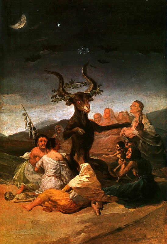
Witches and Old Women was not Goya’s title for the album, and it has to be said that the witch theme does not show Goya at his best. In his study of Goya, the critic Robert Hughes explained how the artist was commissioned to produced a series of witchcraft paintings for the Duke and Duchess of Osumas, who were titillated by the subject ‘rather as one might display a faux-naïve or campy taste for horror movies’. I would use an adjective to describe some of these works, which would generally be thought spectacularly inappropriate for Goya’s work. Witches in the Air seems to me a silly piece, and The Witches’ Sabbath, with its comical billy goat, is little better:


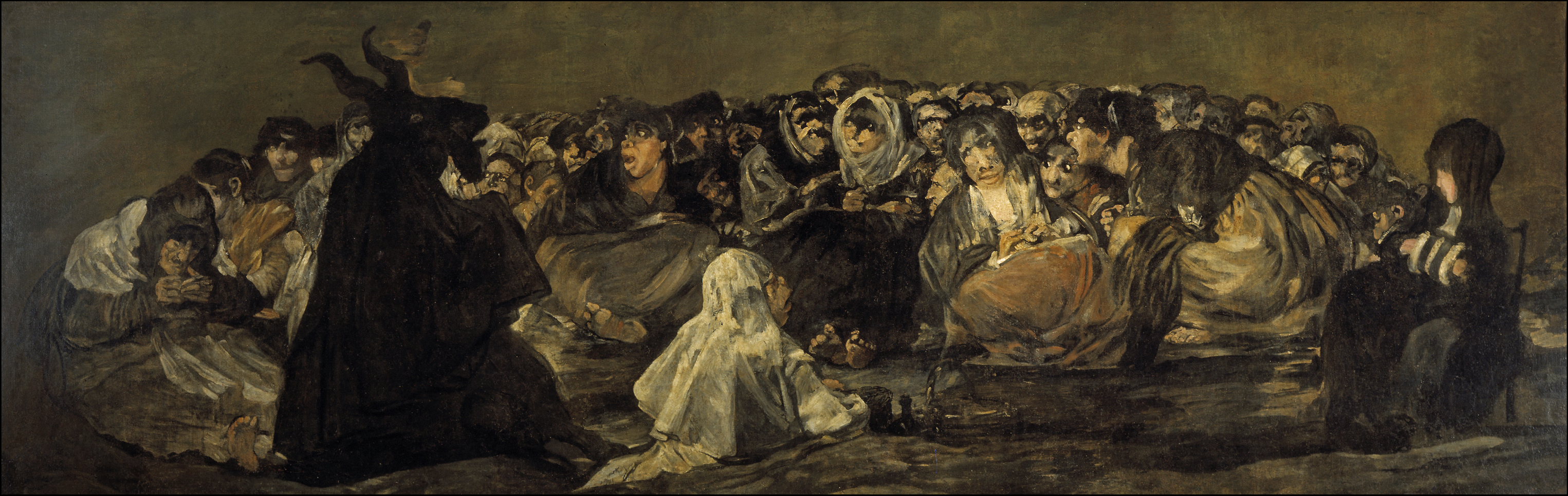
The etchings in Los Caprichos featuring witches and goblins are surely the weakest in the collection. And there is even a horror-entertainment aspect to some of the late Black Paintings. The Witches’ Sabbath from that group, despite the expressionist power of the witches’ faces, still has a silhouetted goat that wouldn’t be out of place in a children’s book:


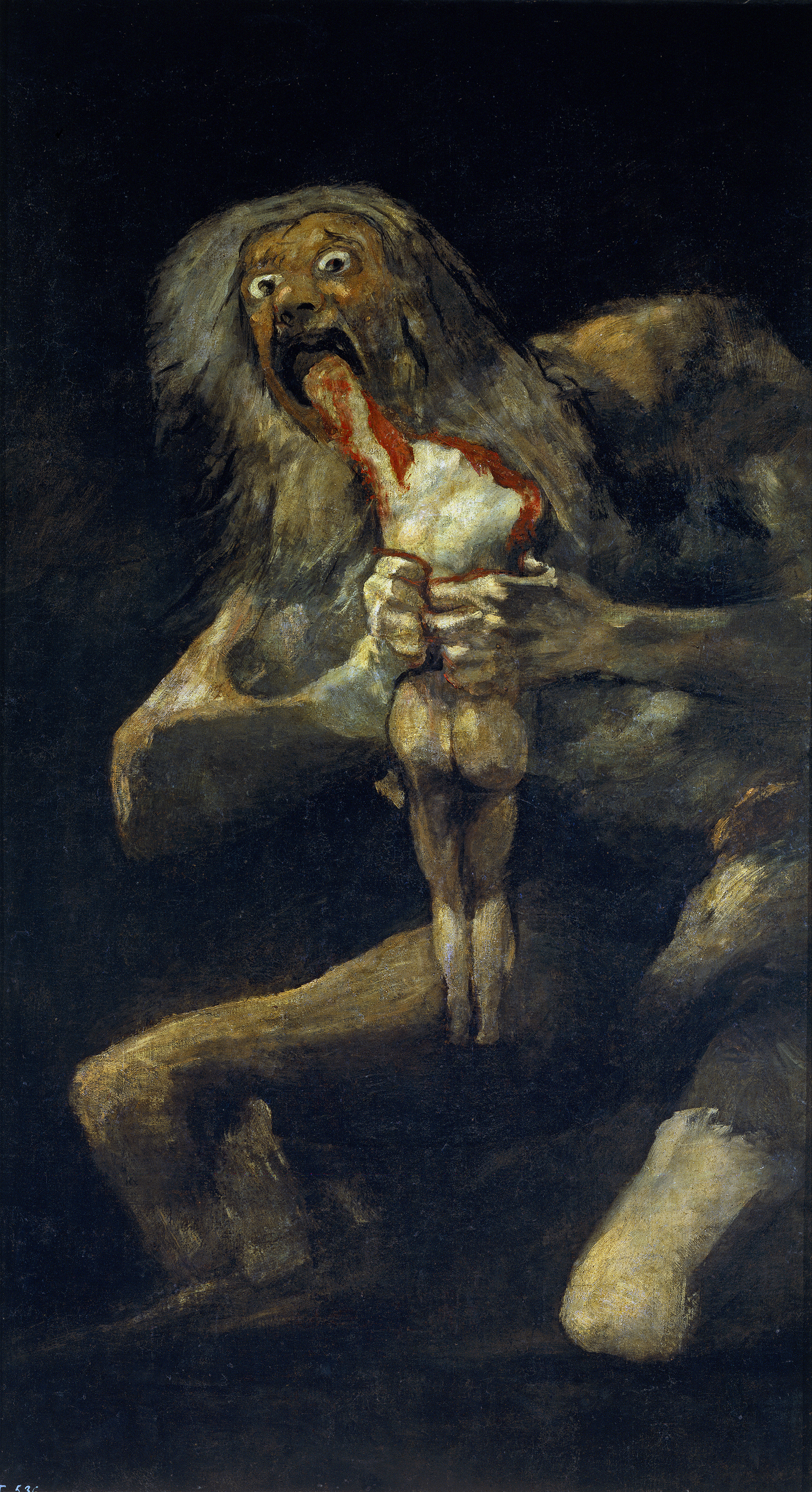
Goya didn’t need fairy-tale horror or even legends like Saturn devouring his sons to inspire him.  He lived through the Peninsular War. His genius for unusual compositions is evident from the first in the Rococo tapestry cartoons, but it reaches its greatest heights in the etching series The Disasters of War. It was achieved without the licence for air-born figures, much evident in the so-called Witches and Old Women Album, that the supernatural world of witches gave him. Where it did pay off magnificently was in the mysterious Sabbath-Asmodeus from the Black Paintings series:


But the catalogue I bought was not a disappointment. The exhibition has given critics a problem. It is almost impossible to describe some of the drawings without reverting to words like ‘hag’ and ‘crone,’ which have no real equivalent for males. The Sunday Times art critic, Vlademar Januszczak, has even accused Goya of 'spectacularly unrestrained' misogyny. Yet, the albums title does not accurately describe all the contents. The drawing chosen for the catalogue cover, Mirth, shows a jolly couple of advanced years embracing in mid-air. There are several works best described as genre pieces: an old women on her knees saying her prayers; two old women fighting; a ninety-eight year old man with two sticks; another who wakes up kicking; an old women who talks to her cat, with nothing to suggest that she is a witch with her familiar. All the works are drawn with brush using black and grey ink. Two of them, Covetous Old Hag and Mother Celestina, the archetype Spanish bawd, are remarkable for their use of the medium to show poverty and ragged clothing.

One ambiguous work, entitled Dream of a Good Witch, I vote Goya’s best-ever witch image. It shows a bent old woman carrying on her back a load of trussed-up babies. It is interesting to compare this drawing with another from the album, showing a woman holding a child. Her definitely witchified features, sharp teeth and all, leave us in no doubt that she is about to eat the child, but it is the stuff of grim or Grimm’s fairy tales. We may shudder, but we are not meant to really believe. The realness of the women in the Good Witch drawing, on the other hand, takes us out of the area of horror titillation. We may think of famine cannibalism or some edict from above – the killing of the first born or something like that – where the poor are brought in to do the evil work.     


'There's no art to find the mind's construction in the face.'


With the televising of Hilary Mantel’s novel Wolf Hall an argument is developing which may even have a sectarian character. Mantel, a convent girl herself, is accused of ‘horrible history’ over her sympathetic treatment of Thomas Cromwell and her ‘character assassination’ of Thomas More.  Writing in the Sunday times Daniel Johnson blames Protestant propaganda and although he admits that ‘the saintly Thomas More’ did torture and burn six individuals accused of heresy, he was just carrying out his duty according to the law. The Sunday Times art critic Waldemar Januszczak who had a Catholic upbringing, is also  having nothing to do with Mantel revisionism, as he has made clear in an article and in his television piece on the painter Hans Holbein the Younger.

I have no religious views myself (although my parents attended the Church of Scotland) but it does seem to me that it was no bad thing that ordinary people should be able to read the principal text that was the basis of the religion they were supposed to be adhering to and that the Reformation was a move towards enlightenment even though the Protestants were soon matching the old Church with their own atrocities. If Cromwell did indeed try to intervene in the case of the supposed heretic Little Bliney, he is a bit redeemed in my eyes. As for Thomas More, it seems to me incredible that the Roman Catholic Church should have made him a saint in the twentieth century.

When I read Wolf Hall and Bring Up the Bodies, I found myself constantly looking at the portraits of the characters produced by Holbein the Younger. I have a catalogue of his drawings from the Queen’s Collection shown many years ago in the National Gallery of Scotland and also several reproductions of the Tudor paintings. I thought I could detect signs of humanity in Cromwell although he was obviously wary, watching his back. More, I thought, looked shifty. Unequivocally, Norfolk looked a thorough thug. But it raises the question: how much can painters portray the mental make-up of their sitters?

Many years ago I remember a critic objecting to the idea that Rembrandt painted the human mind, and he added that even Gombrich was not immune to such nonsense. Nobody, he avowed, painted the human face more like a still life than Rembrandt. Gombrich replied, pointing out that what he had written was, ‘I know no other way of describing the almost uncanny knowledge Rembrandt appears to have had of human feelings and human reactions’ (My italics). The critic duly apologised.

It is tempting to divide portrait painters into two groups, the hard-lookers and the flatterers. Rembrandt was certainly a hard-looker, but one who was pretty much unique in his use of paint. Some of his self-portraits, like that in the National Gallery of Scotland are worked in unbelievable detail without the hard porcelain effect usual in most precision works.  Holbein was also a hard-looker, in a different style. Among the most famous flatterers are van Dyck and Velasquez.

Charles I was in actuality a rather vertically challenged individual yet in paintings by van Dyck he appears as a tall elegant cavalier. Obviously, hard-looking had to be modified in some circumstances. Velasquez had a different type of problem to cope with: the Hapsburg chin. The Emperor Leopold I had such an enlarged lower jaw that when outdoors his mouth filled with rain. Several of the family were unable to eat in company. In the Kunsthistorisches Museum in Vienna, alongside portraits by Velasquez of Philip IV can be seen a portrait bust of his son Charles II. The sculpture shows just how grotesque this trait could be. Even if Philip was not so badly afflicted as his heir, I think a certain chin reducing is detectable in the great court-painters work.

I was recently looking through a catalogue from an exhibition entitled The Early Portrait from the collections of the Prince of Liechtenstein and the Kunstmuseum Basel. The northern artists were not mainly household names, but they were all hard-lookers and seemed to give psychological insights. My conclusion is that if a painter looks intently and records visual characteristics, he or she will also appear to give psychological insights, which may or may not be accurate. What anyone gleans, from looking at Holbein’s portraits of the Tudors will depend on other things.


CABU


I am with the French that we cannot let nihilistic fanatics change our values by murder, and all reasonable people will try to put themselves in a mental area of empathy towards relatives and friends of the victims of the massacres in Paris, Pakistan and Nigeria, not to mention the atrocities in upstart and established states and indeed in the regimes of realpolitik allies. Yet there is a truth embedded in that chilling sentence in Jane Austen’s letter to her sister Cassandra on hearing of the casualties in the Battle of Albuera: “How horrible it is to have so many killed - And what a blessing that one cares for none of them.” We cannot match the grief of those directly involved. They will be scarred for life. We would be unable to function were we able to mourn the victims with the same intensity. But I do feel a personal bereavement for one of the murdered cartoonists, even if it’s intellectual and aesthetic.

When in France I don’t regularly buy Charlie Hebdo. My favourite satirical weekly is Le Canard Enchaine, which I can also get in Edinburgh. I find the latter more stylish. Its team of cartoonists are all very distinctive. Kiro specialises in highly finished caricatures of national and international worthies; Wozniak is a modernist, highly decorative, owing something to Klee and Miro; Kerleroux has a wiry line, Pancho an angular crayoned one; Lefred-Thouron’s figures are disjointed, Pétillon’s blobby, Potus’s elegantly distorted; Cardon’s shows his characters mainly from the back. The paper is a poly-stylistic feast. In contrast, the Charlie style is in the main cruder. The prolific Jean Cabut seems to be the only cartoonist who worked for both journals.

The hefty tome that Le Canard Enchaine produced for its fiftieth anniversary in 2008 shows Cabu first appearing there in 1982 with a strip cartoon on Mitterand, then French president. With many cartoonists you get to know their main political figures without their being brilliant likenesses. But Cabu was a portraitist, not in the highly worked style of Kiro, but in line. This allowed him to bring to his work  recognisable characters, who  had suddenly burst on the scene. He also had his stock of types, a fat moustachioed prole, and an equally overweight female battle-axe, a big-jawed, thick -looking soldier. In later years Cabu produced a strip for the Canard featuring the Nouveaux Beaufs. He is credited with establishing the slang term beauf for a vulgar, unmannerly, misogynist oaf. The main character in the strip is ugly, unshaven, pony-tailed and invariably wearing dark glasses and cowboy boots.

Cabu’s appearance in the Canard coincides with my taking an interest in French politics, Thus my image of the sequence of French presidents is through his drawings: the short figure of Mitterand with his long upper lip doing his best to look thoughtful and dignified; Chirac with his great jaw, often wide open, in carpet slippers drinking cans of beer in front of the telly or deck-chaired on holiday with shorts and sandals worn with socks supported by suspenders, and finally trying to get a pledge that all the teaspoons are not  to be counted as he makes way for a new inhabitant of the Elysée; Sarkozy, latterly portrayed as an imp with vestigial horns, nursed by his much taller partner but with his perpetual self confidence generally annoying all around him; and in recent times, the podgy Hollande with his women trouble and motorbike visits. Then there are memorable images of a host of less central characters, the mistresses, the supporting politicians, De Villepin, Dati, Juppé, Rafferin,  MAM, Ségolène, DSK,  the le Pens, Johny, Tapie. All these and many, many more, if I think about them I visualise in Cabu’s cartoon portraits.

In many edition of the Canard there were more drawings by Cabu than by anybody else. I don’t know if that was the case with Charlie Hebdo. But I do possess an Hors Serie, Charlie magazine by the murdered cartoonist called La methode à Cabu. It purports to be a How-to-Draw-Cartoons book. Of course it’s a spoof. You are shown how beginning with a lavatory type drawing of a cock and balls and adding some other simple shapes, including the silhouette of a polecat to represent hair, you can produce a likeness of Sarkozy’s prime minister Francoise Fillon. He claims he derives the lips of Martine Aubrey, the prominent socialist politician and daughter of Jacques Delors, from a copulating couple. The Prophet got off lightly.

This wonderful artist and gentle mocker is somebody I will sadly miss.


ART AND THE DOMESTIC WALL


Because of the way the art world has developed, anything that could possibly be hung on a domestic wall has come to be considered, at best, middlebrow. Ambitious young artists can be observed doing everything to avoid this description. Their work is very large, conceptual, in video or in other forms that preclude the pin and hook or picture rail display. Their work can be very expensive, suggesting that they hope to be bought by a public gallery or a rich collector. In this they are likely to be disappointed. Both the galleries and the seriously affluent are autograph collectors. Somehow the artist has to achieve sufficient publicity first to justify the signature. 

I had these thoughts when viewing a work in Edinburgh Printmakers winter exhibition, No Fixed Abode. The show is the result of collaboration between the artists and the Big Issue editor and sellers. The work in question is Mark Doyle’s piece consisting of four hot water bottles cast in concrete. To my mind this is by far the best exhibit. It is entitled Home is where the Hot Water is, and certainly makes you think of the miseries of homelessness when you are having your routine hot shower each morning, and even if you are skimping on the central heating, you can look forward to a warm bed. The exhibition on the whole is rather thin and it must have pleased the organisers to have one exhibit which so neatly and ingeniously encapsulates the theme.

The work is modestly priced at £250, but with its wit and form it keeps on the right side of the dreaded middlebrow, bourgeois division. While not technically a print, it is a multiple and if Doyle sold out his edition of ten, after he had paid commission and VAT, he might be able to live for a month on the proceeds without involving the filthy- rich, bonus-bloated bankers and the like, who young artists tending to be on the left are apt to dislike. But he is probably unlikely to do so because of the domestic hanging problem, not insoluble for this work but which would require some work on the average plaster or plasterboard wall.

Faced with this situation what can young artists do? Traditional printmaking techniques could be one solution. Depending on content, prints might more easily escape the middlebrow grading than paintings. Doyle, for instance could create a screen-printed version of his work uniting the images with the title, which gives the concept its full impact and run off a large edition. There would be no loss of integrity in doing so. A very good precedent was set by that iconic modernist Marcel Duchamp who made small, more manageable versions of his major works, The Fountain, Large Glass et al, to fit into a box. He made a small number to start with but stated that he was willing to produce more if there was a demand.

Alternatively, young artists could shun any compromise with the domestic wall and go on producing works of wit and inventiveness while drastically increasing prices and size. They might be able to create the sort of publicity that will lead eventually to public galleries buying their work and things might snowball. They will not, most likely, be able to store all the lead up work but need not worry. No doubt some enterprising dealer will spot an opportunity to recreate multiples of destroyed pieces, just as happed with Duchamp’s urinal, which the artist tossed out. Or does history ever quite repeat itself?


STEVEN CAMPBELL


I returned to the Royal Scottish Academy’s Galleries many times to view the partial reconstruction of Steven Campbell’s 1990 work On Form and Fiction before it was taken down. I have no idea who now owns this piece, probably his family, but I repeat my previous suggestion that a permanent site should be found for it. Perhaps Summerhall, Edinburgh, would have space, and if that was to be considered, Glasgow worthies might be aroused to claim the artist’s piece for themselves.

The assemblage – I’m avoiding the term installation to prevent contamination  – consists of a number of framed paintings around 109 cm square hung at intervals surrounded by sketches one of which is developed in the central work. Despite the variety of images, techniques, styles and ideas involved in all this, it is impossible to find any awkward arrangement or signs of a changed decision. Campbell’s compositional abilities are infallible and spontaneous. All the elements of Campbell’s genius are here. Yet his best work was still to come.

Campbell never relied on gigantic scale to make an impact, unlike so many modern artists. In the three important exhibitions in Scotland that followed On Form and Fiction, Pinocchio’s Present, 1993 and The Caravan Club, 2002, both at The Talbot Rice Gallery, Edinburgh and the posthumous exhibition shared between Glasgow Print Studios and Glasgow school of Art, 2008, no painting is much bigger than Constable’s six footers. But they display the most incredible invention, which seems to flow organically. The human figure is ever-present combined in the most energetic positions, falling, dismembered, emerging three-dimensionally-modelled from flat backgrounds, dissolving, even mutating. Yet the painter never resorts to any stylisation or cubist clichés that so dates many paintings influenced by early modernism. Also, he avoids the sort of arbitrary distortion that spoils some of Stanley Spencer’s work. There is a fabulous wealth of imagery and this, plus bright colour, flat pattern making, representational painting and at times even expressionist brushwork, is all orchestrated to read perfectly. Campbell can make absolutely anything work.

The jazz and classical saxophonist Branford Marsalis was recently on Radio 3’s weekday, morning feature, where a distinguished guest discusses musical experiences and chooses music. Marsalis talked of his amazement on first hearing Richard Strauss’s revolutionary opera Salome. However, when it came to choosing some music to be played, he selected a passage from Der Rosenkavalier. The interviewer was clearly perplexed. The saxophonist explained that in the later opera, Strauss demonstrated that he knew all classical music. In the same way we are aware that Campbell understands and uses, the whole history of Western visual art and thus avoids the path of linear innovation, each step attempting to trump the previous one, that arrives at unmade beds, a light being switched on and off, canned artists’ excrement and so on.

Faced with work like Campbell’s, the puzzled layperson is apt to ask, ‘What does it mean?’ A literary key is sought. But paintings don’t work that way. Some paintings may have a story behind them but they have to outlast their iconography otherwise we could make nothing of work from different cultures and different belief systems. Campbell in an early exhibition at the Fruit Market Gallery, Edinburgh, drew inspiration from the stories of P. G. Wodehouse.  Knowledge of this would not help in the appreciation of his work. He has also drawn on Hichcock films. Yet I am a confirmed enthusiast for Campbell’s painting without ever having seen a single one of the director’s works.

In the catalogue for The Caravan Club there is a reproduction of a painting in acrylic on paper, measuring 65x74.5 inches, entitled A bag of dust mite balls goes by perspectively. It is a favourite of mine. In the upper part of the composition a number of figures are behind windows. They could be of a bus or a train. Three arms appear to reach out holding leather cash type bags with metal clasps arranged in strict perspective. Yet they are not attached to the figures, only to the bags by their gripping hands. Columns of dust spout from the clasps, ending in human heads. The work is very painterly, in parts in a watercolourly way.

I know little of how Campbell worked, except that he generally painted his oils on unstretched canvas, stretching the pieces when finished. It is unlikely that he thought up zany ideas and then painted them up like Magritte or Dali would. I feel it belittles this painting to call it surrealist. Magical is more appropriate. One feels that in some mysterious way Campbell’s brush and his imagination worked together to produce immaculate conceptions like this one.
      

VISUAL ART IN EDINBURGH 2014


Depending on what was first visited, this year’s Edinburgh Festival might seem a poor one for visual art. The main imported show at the SNG Modern 2 until 19th October, is American Impressionism.

Impressionist exhibitions are often seen as pandering to middle-brow, conservative taste but I rather like them. Painters of the school often painted a work a day for large periods of their lives, so there is a good chance of seeing paintings that have not been killed off by continuous reproduction. Unfortunately, there were very few American works in this collection that merited a second glance. Mary Cassatt, America’s one genuine Impressionist, was not even represented by her best work, and of the two fine Whistler seascapes reproduced in the catalogue, only one made it to Edinburgh. The display might have been boosted by some of the early works by Edward Hopper that could plausibly come under the Impressionist banner.

At SNG Modern 1, hosting part of the multi-venue Generation exhibition, we were reminded of how greedy contemporary art is for space (installations) and consumptive of time (slowed down films and videos) providing little enlightenment, entertainment or excitement, and all in a building that is so unfriendly to this sort of thing that you think ‘mistake’ and ‘misuse’.

The SN Portrait Gallery has two very disparate exhibitions, John Ruskin: Artist and Observer and John Byrne: Sitting Ducks. I would sum up both with the same phrase: skilful but not very exciting.

However, there are two wonderful visual experiences to be had in Edinburgh this year.
At the SNG at the Mound until 14th September, the three greatest Titians can be seen together. It is no exaggeration to say that this is the chance of a lifetime.

In the RSA building the reconstruction of part of Steven Campbell’s exhibition On Form and Fiction of twenty-four years ago, affirms that not all is over for painting in the twenty first century. Campbell, who sadly died at the height of his powers, was that rare thing, an intellectual painter. He solved the problem for the modern artist of ‘making it new’ not by following a teleological line leading to attenuation and nothingness, but simply by being unremittingly inventive with compositional infallibility. I hesitate to call this work an installation. Rather it is the intellectual decoration of a space with large paintings in colour surrounded by additional compositions in monochrome. It would be futile to look for any literary key to this work, but there is a figure constantly on the move in the monochrome works that wonderfully binds the whole piece together with the ghost of a narrative.

While this Campbell masterpiece could not have been produced at any other time than late twentieth century, it is part of its allure that it hints at some fictitious Renaissance palace.
Yet there are very few rooms successfully decorated in a cohesive fashion with the full glory of expressive art from that or any other era. Because of haphazard commissioning, the Sistine Chapel is a mess. The Michelangelo ceiling, which is further away from the viewer, is on a bigger scale than the same artist’s Last Judgment, the side wall is a hotchpotch. With artists not having full control many great works are crowded into side chapels piled one on the top of another. Mantegna’s great Camera degli Sposi is an exception, Giotto’s Arena Chapel another. In Britain some might suggest Stanley Spencer’s Sandham Memorial Chapel but for me it is ruined by the ugly divisions between the panels, some of which are not Spencer at his best.

Surely some permanent site should be found for the Campbell work. It would be a wonderful asset for Edinburgh or Glasgow.


ARTISTS AND NATIONALSIM


Must there always be a nasty edge to nationalism? We’ve already had a Scottish writer using the categories 'settlers and colonialists' about the English in Scotland and chuckling on a television interview over the reaction it caused. But artists have a very bad record in this area and much greater figures than Alasdair Gray have been guilty.

Wagner immediately comes to mind. He wrote a notorious essay Judaism in Music 
and after his death, he had the burden of being Hitler’s favourite composer. It worked the other way for the Danish/German painter Emile Nolde. His posthumous reputation was saved by his work being included in Hitler’s Exhibition of Degenerate Painters. He was, in fact, a nasty northern nationalist, a member of the Nazi Party expelled from the Berlin Secession for anti-Semitism.

Some of the Russian nationalist composers known as the Mighty Handful were also anti-Semitic and on occasion it got into their music. It is difficult to see how music can show this vile prejudice, but apparently the Goldenberg and Schumuyle movement from Mussorgsky’s Pictures at an Exhibition is an attempt. Simon Winder in his history of the Habsburgs, Danubia, writes that Janacek ‘was a thoroughly unpleasant Slav nationalist of a dotty kind’. Because of the settling of nationalist scores after the fall of the Austrian-Hungarian Empire, Winder also suggests that Mahler, a German-speaking Moravian and a Jew to boot, and Hugo Wolf, a German Slovenian, were perhaps fortunate to die before the deluge.

There are a fair number of great writers from the past who show a nationalist-hate side. Norway’s Nobel laureate, Knut Hamsun showed his nasty northern nationalism in his obituary of Hitler, calling him ‘a reformist character of the highest order (to whom) we his close followers bow at his death’. He had previously given his Nobel prize money to Goebbels. France also had a very unpleasant novelist of high literary quality, Céline, equally famous for his disgusting anti-Semitic tracts. At least France has not seen fit to name a public building after him. However, in the Norwegian village of Oppeid there is a Knut Hamsun Centre, which has been described as a stunning piece of concept architecture.

We can still to be shocked by what is unearthed about artists we admire. The current Times Literary Supplement has a note about a collection of Scottish war poems edited by David Goldie and Roderick Watson. J. C. comments: “Unmentioned by the editors are the fanatical musings of Hugh MacDiarmid, who wished good luck to Luftwaffe bombers circling over London in the Blitz, and asked, ‘Is a Mussolini or a Hitler / Worse than a Bevin or a Morrison?’ Who would have thought that for all his outrageousness, C. M. Grieve could have been such a horrible N.N.N?