WALDEMAR’S BOSH ON BOSCH


It would take a longer piece than I have time to write if I were to list all the absurdities put forward by Waldemar Januszczak in his four-part television series, The Renaissance Unchained, and his review in The Sunday Times of the Hieronymus Bosch exhibition in the artist’s hometown, which heralded it.

Bosch may well have been a contemporary of Leonardo da Vinci but that doesn’t make him a Renaissance artist and not being one doesn’t mean that we cannot recognize his exceptional assets as, in Sir Herbert Reed’s words, ‘essentially a late medieval Gothic artist.’ And Bosch’s type of invention and fantasy is not unique. He just produced it in more profusion. In what I consider Bosch’s best composition, the right hand panel of The Garden of Earthly Delights triptych, a blue devil with a birdlike head who appears to be sitting on a very tall commode, is swallowing a human body and we see below other figures who have gone through the devil’s digestive system falling into presumably, an even deeper layer of hell. Giotto (and for all I know perhaps many others) produced such an image a century before. My grandchildren, aged five and seven, have just returned from a holiday in the Veneto where one of the highlights was a blue devil devouring and excreting unfortunate, still living sinners in the last judgment in the Arena Chapel, Padua. Admittedly, the flight of birds that appear from between the buttocks of the half-devoured victim in The Garden of Earthly Delights panel is definitely an individual Bosch touch.

I mentioned this last piece of invention to a friend who I knew to be a Bosch enthusiast. He was intrigued. He had never noticed it. We are not guided by compositional means towards Bosch’s high points. Instead we have to work hard to find them. This is what separates him from his true Renaissance contemporaries. The current edition of the art magazine, Apollo, has a detail from The Garden of Earthly Delights on its cover. It shows part of a procession with, in the selected section, bits of various animals, a mounted figure and a huge circular fan decorated with a porcupine upon which is perched an egret. Beside it is some sort of globe where another large bird is perched with a smaller breed on top. It is a lot to describe but it reads clearly and is exquisitely painted. Finding the passage in a reproduction of the work, it appears less impressive. What the designer of the cover has done, is not only to have isolated a detail but cut it out completely from the background.
  
Januszczak’s suggestion that we have all been conned by Vasari’s delineation of a renewed interest in the Classical world in the 14th and 15th centuries which he called the Renaissance, as an Italian chauvinist attempt to discredit Northern artists is absolute nonsense, as is the idea that most art of the modern era would have been impossible without Bosch. What the modern artist might usefully learn from Bosch is that the history of worthwhile art does not always proceed in a straight line. It is possible to produce great art that is out of sync with the current zeitgeist. At a time when today’s visual art is becoming thinner and thinner in content, the logic of the situation may demand some disconnection from the supposedly progressive line.


AT THE QUEEN’S  GALLERY

Jan Vermeer is certainly the greatest of the Dutch Little Masters and Pieter de Hooch would be high on the list of runners-up. But although there is a Vermeer and several de Hoochs in the current exhibition of Dutch paintings at the Queen’s Gallery, Edinburgh, it was a work by another painter that I was most thrilled to see.

The little oil on panel measuring 47.3 x 59.7 by Hendrick  Pot (1585-1657) is a tiny masterpiece. I have seen a reproduction of this portrait group of Charles I, his queen and baby before and wondered why Pot is not better known. Everything about the work is perfect: the composition, the subdued pinks and gold, the unobtrusive detail. Henrietta Maria sits at one end of a long table supporting the future James II on the table. At the other end stands Charles dressed in black, not as a tall elegant cavalier as portrayed by Van Dyke, but as what he probably was in real life: an exquisite miniature. That the figures could be painted in their finery on such a scale is a marvel.

In the exhibition there is another painting by Pot. It is slightly larger and much less impressive. It is possible that to earn a living Pot had to try all sorts of themes that didn’t best suit his abilities.


EXHIBITION: NATURAL AND UNNATURAL WORLDS

I am exhibiting paintings and prints at The Sutton Gallery, 18a Dundas Street, Edinburgh EH3 6HZ until 31st October 2015. The opening times are Tuesday - Saturday 11am to 5pm.

This collection of my work is the result of spending several months living next to a forest and shows a departure from my more usual urban themes: http://www.thesuttongallery.com/robert-crozier.html

GOYA AND WITCHES


I have managed to resist a trip to London to view the latest batch of blockbuster exhibitions but not the buying of the catalogue for the exhibition The Witches and Old Women Album by Goya at The Courtauld Gallery. It will join on my shelves books of Goya’s drawings and all his etching series, drawings and etchings by Rembrandt, and drawings by Watteau. Graphic work in reproduction is much more satisfactory than paintings reproduced in book form, and these three artists are favourites of mine. The twenty-two works from the Courtauld exhibition in the catalogue are presented in the exact size of the originals.

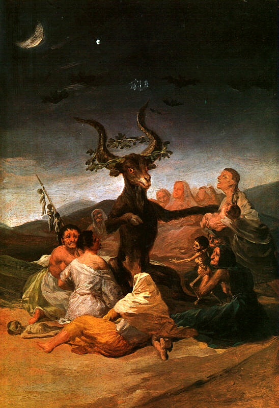
Witches and Old Women was not Goya’s title for the album, and it has to be said that the witch theme does not show Goya at his best. In his study of Goya, the critic Robert Hughes explained how the artist was commissioned to produced a series of witchcraft paintings for the Duke and Duchess of Osumas, who were titillated by the subject ‘rather as one might display a faux-naïve or campy taste for horror movies’. I would use an adjective to describe some of these works, which would generally be thought spectacularly inappropriate for Goya’s work. Witches in the Air seems to me a silly piece, and The Witches’ Sabbath, with its comical billy goat, is little better:


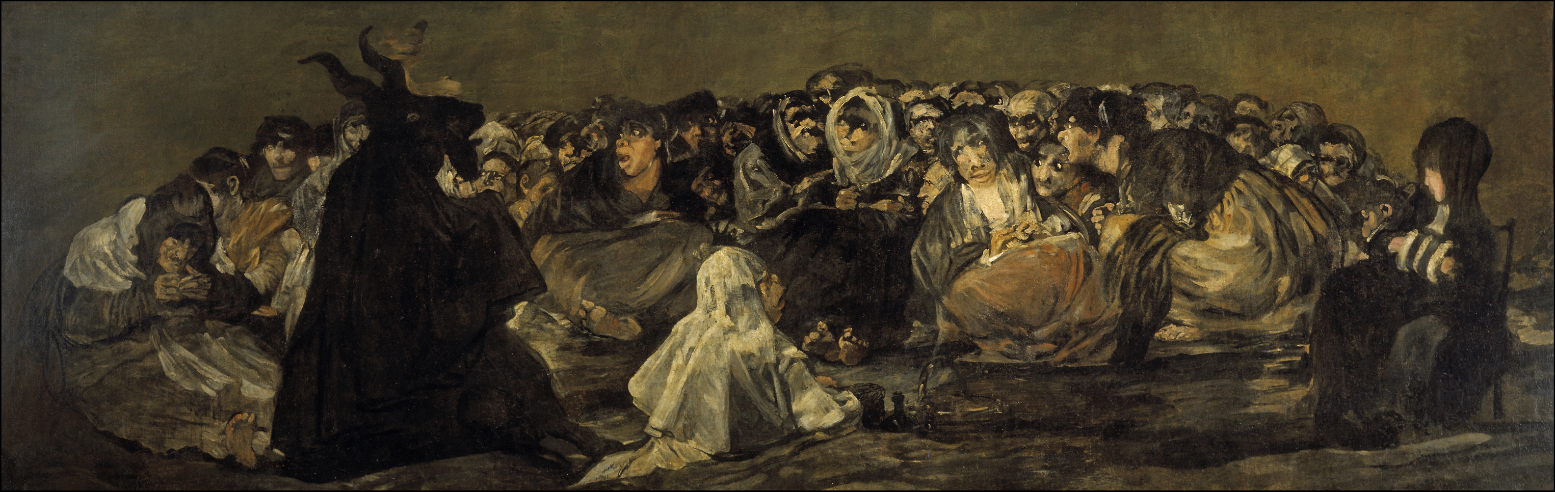
The etchings in Los Caprichos featuring witches and goblins are surely the weakest in the collection. And there is even a horror-entertainment aspect to some of the late Black Paintings. The Witches’ Sabbath from that group, despite the expressionist power of the witches’ faces, still has a silhouetted goat that wouldn’t be out of place in a children’s book:


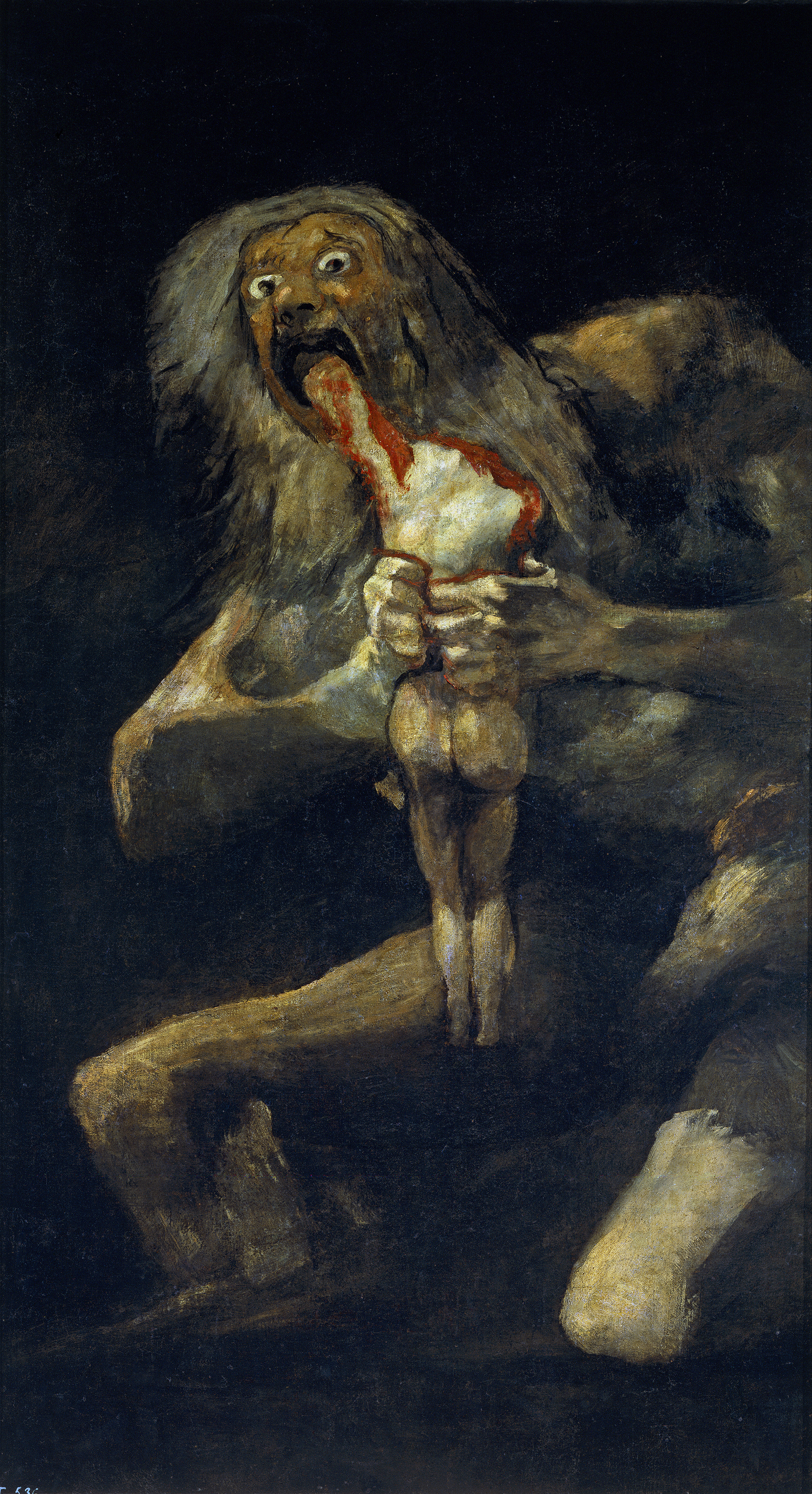
Goya didn’t need fairy-tale horror or even legends like Saturn devouring his sons to inspire him.  He lived through the Peninsular War. His genius for unusual compositions is evident from the first in the Rococo tapestry cartoons, but it reaches its greatest heights in the etching series The Disasters of War. It was achieved without the licence for air-born figures, much evident in the so-called Witches and Old Women Album, that the supernatural world of witches gave him. Where it did pay off magnificently was in the mysterious Sabbath-Asmodeus from the Black Paintings series:


But the catalogue I bought was not a disappointment. The exhibition has given critics a problem. It is almost impossible to describe some of the drawings without reverting to words like ‘hag’ and ‘crone,’ which have no real equivalent for males. The Sunday Times art critic, Vlademar Januszczak, has even accused Goya of 'spectacularly unrestrained' misogyny. Yet, the albums title does not accurately describe all the contents. The drawing chosen for the catalogue cover, Mirth, shows a jolly couple of advanced years embracing in mid-air. There are several works best described as genre pieces: an old women on her knees saying her prayers; two old women fighting; a ninety-eight year old man with two sticks; another who wakes up kicking; an old women who talks to her cat, with nothing to suggest that she is a witch with her familiar. All the works are drawn with brush using black and grey ink. Two of them, Covetous Old Hag and Mother Celestina, the archetype Spanish bawd, are remarkable for their use of the medium to show poverty and ragged clothing.

One ambiguous work, entitled Dream of a Good Witch, I vote Goya’s best-ever witch image. It shows a bent old woman carrying on her back a load of trussed-up babies. It is interesting to compare this drawing with another from the album, showing a woman holding a child. Her definitely witchified features, sharp teeth and all, leave us in no doubt that she is about to eat the child, but it is the stuff of grim or Grimm’s fairy tales. We may shudder, but we are not meant to really believe. The realness of the women in the Good Witch drawing, on the other hand, takes us out of the area of horror titillation. We may think of famine cannibalism or some edict from above – the killing of the first born or something like that – where the poor are brought in to do the evil work.     


'There's no art to find the mind's construction in the face.'


With the televising of Hilary Mantel’s novel Wolf Hall an argument is developing which may even have a sectarian character. Mantel, a convent girl herself, is accused of ‘horrible history’ over her sympathetic treatment of Thomas Cromwell and her ‘character assassination’ of Thomas More.  Writing in the Sunday times Daniel Johnson blames Protestant propaganda and although he admits that ‘the saintly Thomas More’ did torture and burn six individuals accused of heresy, he was just carrying out his duty according to the law. The Sunday Times art critic Waldemar Januszczak who had a Catholic upbringing, is also  having nothing to do with Mantel revisionism, as he has made clear in an article and in his television piece on the painter Hans Holbein the Younger.

I have no religious views myself (although my parents attended the Church of Scotland) but it does seem to me that it was no bad thing that ordinary people should be able to read the principal text that was the basis of the religion they were supposed to be adhering to and that the Reformation was a move towards enlightenment even though the Protestants were soon matching the old Church with their own atrocities. If Cromwell did indeed try to intervene in the case of the supposed heretic Little Bliney, he is a bit redeemed in my eyes. As for Thomas More, it seems to me incredible that the Roman Catholic Church should have made him a saint in the twentieth century.

When I read Wolf Hall and Bring Up the Bodies, I found myself constantly looking at the portraits of the characters produced by Holbein the Younger. I have a catalogue of his drawings from the Queen’s Collection shown many years ago in the National Gallery of Scotland and also several reproductions of the Tudor paintings. I thought I could detect signs of humanity in Cromwell although he was obviously wary, watching his back. More, I thought, looked shifty. Unequivocally, Norfolk looked a thorough thug. But it raises the question: how much can painters portray the mental make-up of their sitters?

Many years ago I remember a critic objecting to the idea that Rembrandt painted the human mind, and he added that even Gombrich was not immune to such nonsense. Nobody, he avowed, painted the human face more like a still life than Rembrandt. Gombrich replied, pointing out that what he had written was, ‘I know no other way of describing the almost uncanny knowledge Rembrandt appears to have had of human feelings and human reactions’ (My italics). The critic duly apologised.

It is tempting to divide portrait painters into two groups, the hard-lookers and the flatterers. Rembrandt was certainly a hard-looker, but one who was pretty much unique in his use of paint. Some of his self-portraits, like that in the National Gallery of Scotland are worked in unbelievable detail without the hard porcelain effect usual in most precision works.  Holbein was also a hard-looker, in a different style. Among the most famous flatterers are van Dyck and Velasquez.

Charles I was in actuality a rather vertically challenged individual yet in paintings by van Dyck he appears as a tall elegant cavalier. Obviously, hard-looking had to be modified in some circumstances. Velasquez had a different type of problem to cope with: the Hapsburg chin. The Emperor Leopold I had such an enlarged lower jaw that when outdoors his mouth filled with rain. Several of the family were unable to eat in company. In the Kunsthistorisches Museum in Vienna, alongside portraits by Velasquez of Philip IV can be seen a portrait bust of his son Charles II. The sculpture shows just how grotesque this trait could be. Even if Philip was not so badly afflicted as his heir, I think a certain chin reducing is detectable in the great court-painters work.

I was recently looking through a catalogue from an exhibition entitled The Early Portrait from the collections of the Prince of Liechtenstein and the Kunstmuseum Basel. The northern artists were not mainly household names, but they were all hard-lookers and seemed to give psychological insights. My conclusion is that if a painter looks intently and records visual characteristics, he or she will also appear to give psychological insights, which may or may not be accurate. What anyone gleans, from looking at Holbein’s portraits of the Tudors will depend on other things.


CABU


I am with the French that we cannot let nihilistic fanatics change our values by murder, and all reasonable people will try to put themselves in a mental area of empathy towards relatives and friends of the victims of the massacres in Paris, Pakistan and Nigeria, not to mention the atrocities in upstart and established states and indeed in the regimes of realpolitik allies. Yet there is a truth embedded in that chilling sentence in Jane Austen’s letter to her sister Cassandra on hearing of the casualties in the Battle of Albuera: “How horrible it is to have so many killed - And what a blessing that one cares for none of them.” We cannot match the grief of those directly involved. They will be scarred for life. We would be unable to function were we able to mourn the victims with the same intensity. But I do feel a personal bereavement for one of the murdered cartoonists, even if it’s intellectual and aesthetic.

When in France I don’t regularly buy Charlie Hebdo. My favourite satirical weekly is Le Canard Enchaine, which I can also get in Edinburgh. I find the latter more stylish. Its team of cartoonists are all very distinctive. Kiro specialises in highly finished caricatures of national and international worthies; Wozniak is a modernist, highly decorative, owing something to Klee and Miro; Kerleroux has a wiry line, Pancho an angular crayoned one; Lefred-Thouron’s figures are disjointed, Pétillon’s blobby, Potus’s elegantly distorted; Cardon’s shows his characters mainly from the back. The paper is a poly-stylistic feast. In contrast, the Charlie style is in the main cruder. The prolific Jean Cabut seems to be the only cartoonist who worked for both journals.

The hefty tome that Le Canard Enchaine produced for its fiftieth anniversary in 2008 shows Cabu first appearing there in 1982 with a strip cartoon on Mitterand, then French president. With many cartoonists you get to know their main political figures without their being brilliant likenesses. But Cabu was a portraitist, not in the highly worked style of Kiro, but in line. This allowed him to bring to his work  recognisable characters, who  had suddenly burst on the scene. He also had his stock of types, a fat moustachioed prole, and an equally overweight female battle-axe, a big-jawed, thick -looking soldier. In later years Cabu produced a strip for the Canard featuring the Nouveaux Beaufs. He is credited with establishing the slang term beauf for a vulgar, unmannerly, misogynist oaf. The main character in the strip is ugly, unshaven, pony-tailed and invariably wearing dark glasses and cowboy boots.

Cabu’s appearance in the Canard coincides with my taking an interest in French politics, Thus my image of the sequence of French presidents is through his drawings: the short figure of Mitterand with his long upper lip doing his best to look thoughtful and dignified; Chirac with his great jaw, often wide open, in carpet slippers drinking cans of beer in front of the telly or deck-chaired on holiday with shorts and sandals worn with socks supported by suspenders, and finally trying to get a pledge that all the teaspoons are not  to be counted as he makes way for a new inhabitant of the Elysée; Sarkozy, latterly portrayed as an imp with vestigial horns, nursed by his much taller partner but with his perpetual self confidence generally annoying all around him; and in recent times, the podgy Hollande with his women trouble and motorbike visits. Then there are memorable images of a host of less central characters, the mistresses, the supporting politicians, De Villepin, Dati, Juppé, Rafferin,  MAM, Ségolène, DSK,  the le Pens, Johny, Tapie. All these and many, many more, if I think about them I visualise in Cabu’s cartoon portraits.

In many edition of the Canard there were more drawings by Cabu than by anybody else. I don’t know if that was the case with Charlie Hebdo. But I do possess an Hors Serie, Charlie magazine by the murdered cartoonist called La methode à Cabu. It purports to be a How-to-Draw-Cartoons book. Of course it’s a spoof. You are shown how beginning with a lavatory type drawing of a cock and balls and adding some other simple shapes, including the silhouette of a polecat to represent hair, you can produce a likeness of Sarkozy’s prime minister Francoise Fillon. He claims he derives the lips of Martine Aubrey, the prominent socialist politician and daughter of Jacques Delors, from a copulating couple. The Prophet got off lightly.

This wonderful artist and gentle mocker is somebody I will sadly miss.


ART AND THE DOMESTIC WALL


Because of the way the art world has developed, anything that could possibly be hung on a domestic wall has come to be considered, at best, middlebrow. Ambitious young artists can be observed doing everything to avoid this description. Their work is very large, conceptual, in video or in other forms that preclude the pin and hook or picture rail display. Their work can be very expensive, suggesting that they hope to be bought by a public gallery or a rich collector. In this they are likely to be disappointed. Both the galleries and the seriously affluent are autograph collectors. Somehow the artist has to achieve sufficient publicity first to justify the signature. 

I had these thoughts when viewing a work in Edinburgh Printmakers winter exhibition, No Fixed Abode. The show is the result of collaboration between the artists and the Big Issue editor and sellers. The work in question is Mark Doyle’s piece consisting of four hot water bottles cast in concrete. To my mind this is by far the best exhibit. It is entitled Home is where the Hot Water is, and certainly makes you think of the miseries of homelessness when you are having your routine hot shower each morning, and even if you are skimping on the central heating, you can look forward to a warm bed. The exhibition on the whole is rather thin and it must have pleased the organisers to have one exhibit which so neatly and ingeniously encapsulates the theme.

The work is modestly priced at £250, but with its wit and form it keeps on the right side of the dreaded middlebrow, bourgeois division. While not technically a print, it is a multiple and if Doyle sold out his edition of ten, after he had paid commission and VAT, he might be able to live for a month on the proceeds without involving the filthy- rich, bonus-bloated bankers and the like, who young artists tending to be on the left are apt to dislike. But he is probably unlikely to do so because of the domestic hanging problem, not insoluble for this work but which would require some work on the average plaster or plasterboard wall.

Faced with this situation what can young artists do? Traditional printmaking techniques could be one solution. Depending on content, prints might more easily escape the middlebrow grading than paintings. Doyle, for instance could create a screen-printed version of his work uniting the images with the title, which gives the concept its full impact and run off a large edition. There would be no loss of integrity in doing so. A very good precedent was set by that iconic modernist Marcel Duchamp who made small, more manageable versions of his major works, The Fountain, Large Glass et al, to fit into a box. He made a small number to start with but stated that he was willing to produce more if there was a demand.

Alternatively, young artists could shun any compromise with the domestic wall and go on producing works of wit and inventiveness while drastically increasing prices and size. They might be able to create the sort of publicity that will lead eventually to public galleries buying their work and things might snowball. They will not, most likely, be able to store all the lead up work but need not worry. No doubt some enterprising dealer will spot an opportunity to recreate multiples of destroyed pieces, just as happed with Duchamp’s urinal, which the artist tossed out. Or does history ever quite repeat itself?


STEVEN CAMPBELL


I returned to the Royal Scottish Academy’s Galleries many times to view the partial reconstruction of Steven Campbell’s 1990 work On Form and Fiction before it was taken down. I have no idea who now owns this piece, probably his family, but I repeat my previous suggestion that a permanent site should be found for it. Perhaps Summerhall, Edinburgh, would have space, and if that was to be considered, Glasgow worthies might be aroused to claim the artist’s piece for themselves.

The assemblage – I’m avoiding the term installation to prevent contamination  – consists of a number of framed paintings around 109 cm square hung at intervals surrounded by sketches one of which is developed in the central work. Despite the variety of images, techniques, styles and ideas involved in all this, it is impossible to find any awkward arrangement or signs of a changed decision. Campbell’s compositional abilities are infallible and spontaneous. All the elements of Campbell’s genius are here. Yet his best work was still to come.

Campbell never relied on gigantic scale to make an impact, unlike so many modern artists. In the three important exhibitions in Scotland that followed On Form and Fiction, Pinocchio’s Present, 1993 and The Caravan Club, 2002, both at The Talbot Rice Gallery, Edinburgh and the posthumous exhibition shared between Glasgow Print Studios and Glasgow school of Art, 2008, no painting is much bigger than Constable’s six footers. But they display the most incredible invention, which seems to flow organically. The human figure is ever-present combined in the most energetic positions, falling, dismembered, emerging three-dimensionally-modelled from flat backgrounds, dissolving, even mutating. Yet the painter never resorts to any stylisation or cubist clichés that so dates many paintings influenced by early modernism. Also, he avoids the sort of arbitrary distortion that spoils some of Stanley Spencer’s work. There is a fabulous wealth of imagery and this, plus bright colour, flat pattern making, representational painting and at times even expressionist brushwork, is all orchestrated to read perfectly. Campbell can make absolutely anything work.

The jazz and classical saxophonist Branford Marsalis was recently on Radio 3’s weekday, morning feature, where a distinguished guest discusses musical experiences and chooses music. Marsalis talked of his amazement on first hearing Richard Strauss’s revolutionary opera Salome. However, when it came to choosing some music to be played, he selected a passage from Der Rosenkavalier. The interviewer was clearly perplexed. The saxophonist explained that in the later opera, Strauss demonstrated that he knew all classical music. In the same way we are aware that Campbell understands and uses, the whole history of Western visual art and thus avoids the path of linear innovation, each step attempting to trump the previous one, that arrives at unmade beds, a light being switched on and off, canned artists’ excrement and so on.

Faced with work like Campbell’s, the puzzled layperson is apt to ask, ‘What does it mean?’ A literary key is sought. But paintings don’t work that way. Some paintings may have a story behind them but they have to outlast their iconography otherwise we could make nothing of work from different cultures and different belief systems. Campbell in an early exhibition at the Fruit Market Gallery, Edinburgh, drew inspiration from the stories of P. G. Wodehouse.  Knowledge of this would not help in the appreciation of his work. He has also drawn on Hichcock films. Yet I am a confirmed enthusiast for Campbell’s painting without ever having seen a single one of the director’s works.

In the catalogue for The Caravan Club there is a reproduction of a painting in acrylic on paper, measuring 65x74.5 inches, entitled A bag of dust mite balls goes by perspectively. It is a favourite of mine. In the upper part of the composition a number of figures are behind windows. They could be of a bus or a train. Three arms appear to reach out holding leather cash type bags with metal clasps arranged in strict perspective. Yet they are not attached to the figures, only to the bags by their gripping hands. Columns of dust spout from the clasps, ending in human heads. The work is very painterly, in parts in a watercolourly way.

I know little of how Campbell worked, except that he generally painted his oils on unstretched canvas, stretching the pieces when finished. It is unlikely that he thought up zany ideas and then painted them up like Magritte or Dali would. I feel it belittles this painting to call it surrealist. Magical is more appropriate. One feels that in some mysterious way Campbell’s brush and his imagination worked together to produce immaculate conceptions like this one.
      

VISUAL ART IN EDINBURGH 2014


Depending on what was first visited, this year’s Edinburgh Festival might seem a poor one for visual art. The main imported show at the SNG Modern 2 until 19th October, is American Impressionism.

Impressionist exhibitions are often seen as pandering to middle-brow, conservative taste but I rather like them. Painters of the school often painted a work a day for large periods of their lives, so there is a good chance of seeing paintings that have not been killed off by continuous reproduction. Unfortunately, there were very few American works in this collection that merited a second glance. Mary Cassatt, America’s one genuine Impressionist, was not even represented by her best work, and of the two fine Whistler seascapes reproduced in the catalogue, only one made it to Edinburgh. The display might have been boosted by some of the early works by Edward Hopper that could plausibly come under the Impressionist banner.

At SNG Modern 1, hosting part of the multi-venue Generation exhibition, we were reminded of how greedy contemporary art is for space (installations) and consumptive of time (slowed down films and videos) providing little enlightenment, entertainment or excitement, and all in a building that is so unfriendly to this sort of thing that you think ‘mistake’ and ‘misuse’.

The SN Portrait Gallery has two very disparate exhibitions, John Ruskin: Artist and Observer and John Byrne: Sitting Ducks. I would sum up both with the same phrase: skilful but not very exciting.

However, there are two wonderful visual experiences to be had in Edinburgh this year.
At the SNG at the Mound until 14th September, the three greatest Titians can be seen together. It is no exaggeration to say that this is the chance of a lifetime.

In the RSA building the reconstruction of part of Steven Campbell’s exhibition On Form and Fiction of twenty-four years ago, affirms that not all is over for painting in the twenty first century. Campbell, who sadly died at the height of his powers, was that rare thing, an intellectual painter. He solved the problem for the modern artist of ‘making it new’ not by following a teleological line leading to attenuation and nothingness, but simply by being unremittingly inventive with compositional infallibility. I hesitate to call this work an installation. Rather it is the intellectual decoration of a space with large paintings in colour surrounded by additional compositions in monochrome. It would be futile to look for any literary key to this work, but there is a figure constantly on the move in the monochrome works that wonderfully binds the whole piece together with the ghost of a narrative.

While this Campbell masterpiece could not have been produced at any other time than late twentieth century, it is part of its allure that it hints at some fictitious Renaissance palace.
Yet there are very few rooms successfully decorated in a cohesive fashion with the full glory of expressive art from that or any other era. Because of haphazard commissioning, the Sistine Chapel is a mess. The Michelangelo ceiling, which is further away from the viewer, is on a bigger scale than the same artist’s Last Judgment, the side wall is a hotchpotch. With artists not having full control many great works are crowded into side chapels piled one on the top of another. Mantegna’s great Camera degli Sposi is an exception, Giotto’s Arena Chapel another. In Britain some might suggest Stanley Spencer’s Sandham Memorial Chapel but for me it is ruined by the ugly divisions between the panels, some of which are not Spencer at his best.

Surely some permanent site should be found for the Campbell work. It would be a wonderful asset for Edinburgh or Glasgow.


ARTISTS AND NATIONALSIM


Must there always be a nasty edge to nationalism? We’ve already had a Scottish writer using the categories 'settlers and colonialists' about the English in Scotland and chuckling on a television interview over the reaction it caused. But artists have a very bad record in this area and much greater figures than Alasdair Gray have been guilty.

Wagner immediately comes to mind. He wrote a notorious essay Judaism in Music 
and after his death, he had the burden of being Hitler’s favourite composer. It worked the other way for the Danish/German painter Emile Nolde. His posthumous reputation was saved by his work being included in Hitler’s Exhibition of Degenerate Painters. He was, in fact, a nasty northern nationalist, a member of the Nazi Party expelled from the Berlin Secession for anti-Semitism.

Some of the Russian nationalist composers known as the Mighty Handful were also anti-Semitic and on occasion it got into their music. It is difficult to see how music can show this vile prejudice, but apparently the Goldenberg and Schumuyle movement from Mussorgsky’s Pictures at an Exhibition is an attempt. Simon Winder in his history of the Habsburgs, Danubia, writes that Janacek ‘was a thoroughly unpleasant Slav nationalist of a dotty kind’. Because of the settling of nationalist scores after the fall of the Austrian-Hungarian Empire, Winder also suggests that Mahler, a German-speaking Moravian and a Jew to boot, and Hugo Wolf, a German Slovenian, were perhaps fortunate to die before the deluge.

There are a fair number of great writers from the past who show a nationalist-hate side. Norway’s Nobel laureate, Knut Hamsun showed his nasty northern nationalism in his obituary of Hitler, calling him ‘a reformist character of the highest order (to whom) we his close followers bow at his death’. He had previously given his Nobel prize money to Goebbels. France also had a very unpleasant novelist of high literary quality, Céline, equally famous for his disgusting anti-Semitic tracts. At least France has not seen fit to name a public building after him. However, in the Norwegian village of Oppeid there is a Knut Hamsun Centre, which has been described as a stunning piece of concept architecture.

We can still to be shocked by what is unearthed about artists we admire. The current Times Literary Supplement has a note about a collection of Scottish war poems edited by David Goldie and Roderick Watson. J. C. comments: “Unmentioned by the editors are the fanatical musings of Hugh MacDiarmid, who wished good luck to Luftwaffe bombers circling over London in the Blitz, and asked, ‘Is a Mussolini or a Hitler / Worse than a Bevin or a Morrison?’ Who would have thought that for all his outrageousness, C. M. Grieve could have been such a horrible N.N.N? 

SCOTTISH PAINTING AND NATIONALISM


Moira Jeffrey, in her Saturday Scotsman review of the J.D. Fergusson exhibition, found a few nice things to say about the artist. But she had reservations. The work could be ‘just too sweet and palatable against the acid flavours of his times,’ there were ‘comically proportioned busts and bottoms’ and ‘the irksome nature of some of Fergusson’s paintings speaks for itself. There is their repetiveness, their monumentality, their unique way of being both saccharine and butch.’ My reaction to this, just before the beginning of the year of the referendum on Scottish independence, was to exclaim out loud, ‘Well, there’s a brave girl!’ It seemed like putting a NO sticker in your window and endangering the glazing.

The Scottish Colourists are sacrosanct for much of the Scottish public. Nationalist-inclined politicians like to be photographed in front of their paintings and buy them if they can afford them. The Colourists’ work forms the visual part of the distinctiveness that separatists hope will be boosted by independence. Superiority over English art of the period is claimed, because the Scottish painters with their bright colours, were more in tune with what might be termed the significant forward stream of art history taking place in France with the Post-Impressionists and the Fauves. There were additional Brownie points for the Scots because Fergusson actually took part in a Paris exhibition with some of the French masters.

Such vicarious claims to respectability, however, are double-edged. If you are not in the field for buying, why be content with the substitutes when you can get the real thing? Why look at Peploe when you can look at Cézanne? Why bother with Cadell when you can see what is perhaps Manet’s best still life in a public gallery in Glasgow and his masterpiece of figure composition at the Courtauld in London. As a non-obligated Scot, some of the English Post-Impressionists do seem to me to be more individual, Wilson Steer, for instance and Harold Gilman. And England has throughout produced an array of artists who stand proudly outside the supposed vital juggernaut of art history: Blake, Hogarth, Palmer, Stanley Spencer, Burra, Lowry. There is no Scottishness of Scottish art like there is the Englishness of English art, as Pevsner titled his Reith Lectures.

This not to say there are no very fine Scottish painters. Ramsay’s royal portraits stand up well with any of England’s numerous continental imports (always excepting Holbein and Van Dyck) and his portraits of Rousseau and Hume are works that we look at not just to see what the philosophers were like, but for the art itself. Raeburn stands in the middle of a triumvirate of painters who could construct a perfect human face from a few broad brushstrokes. As he was a jobbing portrait painter, there are some dull works in his oeuvre, but it is remarkable how many are excellent. Yet I wouldn’t quite rank him as the equal of Frans Hals and Manet who make up the trio.

And then, earlier than the Colourists, there is William McTaggart. He is not popular like the former and has probably suffered from attempts to give him significance by linking him to French art as a Scottish Impressionist. But McTaggart cannot be pigeon holed. In some of his best work, he is an odd mixture of landscapist, genre artist and history painter. He also constructed large-scale works from small plein air sketches. If he is to be judged as an Impressionist these things will downgrade him. Many years ago at the Edinburgh International Festival, when a large exhibition of his paintings was mounted, some academics moonlighting as art critics on radio detected some narrative in his work and did just that. Martin Kemp, the Leonardo specialist, who taught art history at St. Andrew and then moved to Oxford (I’m not sure whether he was an Englishman ‘white settling’ in Scotland or a Scotsman who went on to ‘white settle’ in England or vice versa) said at the time that he thought that the exhibition would finally establish McTaggart as an important artist. He also said that he was less sure of the Scottish Colourists.

Three of McTaggart’s greatest works belong to a group which has been called by a biographer his Celtic paintings.They are Emigrants Leaving the Hebrides (Tate Britain), The Emigrants - America (private collection) and The Sailing of the Emigrant Ship which apparently belongs to the Scottish National Gallery. I have never seen it there. Is it because this historical, narrative painting does not fit with the idea of McTaggart as a Scottish Impressionist? Is it another example of the way that nationalist emotion, in trying to escape an inferiority complex, distorts aesthetic judgment?


LONDON EXHIBITIONS


I neither have the time nor the income to traipse down to London to every exhibition I might want to see but I have been lucky to be able to peruse the massive and expensive tomes that pass for exhibition catalogues these days, for both Shunga: Sex and Pleasure in Japanese Art, at the British Museum, and Masterpieces of Chinese Painting 700 – 1900, at the Victorian and Albert.

There is, of course, plenty of Western erotic art around, some of it from the most unlikely figures. Turner and Lowry I believe indulged, if that is the right word, although I have not seen their efforts in this vein. What I am familiar with does not seem to have much to do with making love. It’s all about male lust often tinged with sadism. There are images on Greek pots and even Rembrandt has a couple of etchings of sex scenes, one of a monk rodgering a girl in a cornfield. Some of Picasso’s erotic images show women alone displaying themselves. Where the other sex is involved, and not in the forms of centaurs, satyrs or minotaurs, they display the same lustful characteristics. The many sculptor and model images suggest that the artist has leapt on his model as Rodin was reputed to do.

The Japanese shunga works are quite different. In the main, they show couples enjoying sex together. Women (I hesitate to write feminists for some are against penetration altogether) should approve, as there is great emphasis on female pleasure. Given the giant scale of the sexual organs of both sexes, there is no disguising the fact of male arousal but the curled toes of the women show an equal involvement. In one print, her furrowed brow, indicated with masterful economy by a tiny line, shows the intensity of the woman’s orgasm.

That said, the majority of images in this huge selection are not great works of art.  They are inevitably very repetitious. I was pleased to find that I have a selection of the very best of them by Utamaro, Shuncho and Kuniyoshi in a Thames and Hudson paperback that originally cost £2-50. One of the finest by Utamaro is not explicit at all. It shows a couple lying on a balcony gently touching each other’s face and neck. All that is exposed from under the loose and beautifully patterned fabrics is a glimpse of the woman’s thigh and slender buttocks.

In the exhibition of Chinese painting at the Victorian and Albert Museum the very lengthy scroll Prosperous Suzhou is the work I would have most liked to have seen. The reproduction in its entirety is too small to make anything of.  Leafing through the catalogue, I noted that the first reproduced detail could have been of the restaurant where a group of us ate on a visit to the city this year, but a fuller image later shows the city much changed. The scroll seems to have been made in imitation of the famous Riverside Scene in the Forbidden City, Beijing, painted about four hundred earlier later in the thirteenth century, which I have seen.

While in Suzhou, I visited the New Suzhou Museum designed by I. M. Pei of Louvre pyramid fame. He has a family connection with the city. There I saw an exhibition by a modern Chinese painter He Xi who works in ink and wash on quite a large scale and not in scroll form. His imagery includes fish, insects, plants, animal skins. His achievement is to bring forward the Chinese classical style in the most successful manner that I have come across. I have written before of a contemporary art cliché consisting of a sequence of identically framed variations usually with minimal content. In contrast to these dull works, He Xi has produced an intriguing version where landscapes in the styles of classical masters are contained in glass bottles of different shapes in a bonsai tribute to them. This was only one small part of a wonderful exhibition. I would have loved to take away a well-illustrated catalogue but none was available.    

One is always wary about passing opinions on work one has not actually seen. For this reason, had I been in London, I would certainly have gone to see the murals from the Burghclere Chapel that are being exhibited at Somerset House while the chapel is being restored. Some regard these as Spencer’s masterpiece. I disagree. Much of Spencer’s work, for me, is flawed by awkwardness and arbitrary distortion and some of these defects seem to be prominent in this memorial work based on the artist’s Great War  experience. The curved tops to some of the panels have led to unsatisfactory compositions. But what makes the total effect very ugly in every photograph I have seen is the white bands, broader than the faces of the largest figures that divide the paintings. If these were easel paintings, you would say that they were atrociously framed. Spencer must bear some responsibility. I have read that the scheme was closely based on a drawing of his. Apparently, he was inspired by Giotto’s murals in the Arena Chapel, Padua. But the dividing elements there are covered in geometric patterns, which make them blend in.

Surely, Spencer’s greatest work is the sequence of paintings he produced of the dockyards at Port Glasgow, as an official war artist during the Second World War. They are now in the Imperial War Museum but I was lucky to see them in an exhibition at the Scottish National Gallery, Edinburgh in 2000. The very long, unusually-shaped panels, each dedicated to a particular shipbuilder's craft, welding, riveting, plumbing etc., form tunnels of activity. Everything is lit by the glow of furnaces and welding torches forming harmonies of pinks, oranges and browns with contrasting notes of metallic blues. The figures are not stultified as they might have been if each was based on posed models yet there is not that wilful distortion that can mar some of Spencer’s other work. The actual paint handling is rather beautiful.

 Stanley Spencer (1891-1959) was a contemporary of Marcel Duchamp (1887-1968). Duchamp famously said to Leger and Brancusi, after looking at an aeroplane propeller, ‘Painting is dead.’ His masterpiece the Large Glass uses pictorially, engineering technology, the chocolate grinder and the water mill, that would have been known to Leonardo, perhaps even to the Greeks. Spencer, the eccentric English painter, whose main inspiration was early Renaissance masters, completed his greatest work from imagery drawn from the cutting edge technology of his day.


SCULPTURE'S DULL PERIOD


Reviewing the current exhibition of Daumier at the Royal Academy, London, Julian Bell reproduces a cartoon by the artist, which shows a sculpture that has become animated.  It is in an enraged state because it is being totally ignored by the Salon visitors. Bell quotes Baudelaire suggesting that naturalistic sculpture is boring and satisfies only hicks and savages because something that can be viewed from all angles gives no scope to the imagination.

I have been thinking about these matters, because earlier this year, I had occasion to view sculptures from four different periods in galleries in Toulouse. The Musée Des Augustins, housed in an ecclesiastical styled building, boasts large collections of Gothic, Romanesque and 19th century sculpture, while the Musée Saint-Raymond has the best selection of Roman busts that I have ever come across.

I can’t work up much enthusiasm for Gothic carving. Much of it is obviously highly skilled, but it seems to be for the glory of God rather than the appreciation of mere mortals and in its original positions, gets lost in the other elaborations of the architectural style. The earlier Romanesque sculpture, on the other hand can be full of interest. It had a teaching function to tell the stories of the Bible or frighten us into good behaviour by its visions of Hell. Thus the Romanesque tympanum is at viewable height unlike so many high neoclassical pediments copying ancient Greek architecture where the sculpture was for the eyes of the gods not humans: the famous Parthenon frieze couldn’t be seen at all in situ.

The Toulouse gallery had an extensive collection of Romanesque capitols mounted at eye level on steel plinths. Carving a story round a relatively small block of stone seems to have inspired sculptors. It may be something similar to the way in which the restrictions of traditional prosody can lead to inventiveness in poetry and, although the examples at the Augustins were not of the highest quality they were far superior to the collection of eminently ignorable 19th century pieces. I could imagine a seething mass of furious marble figures coming to life Daumier-like.

Baudelaire may be on to something. On several occasions, I have asked groups of well-informed people, including artists, how many sculptors they can name in the period between the end of the Renaissance and the abandonment of naturalism in modern times. Many can’t come up with any names at all. A few have managed, Bernini, Canova and Rodin while I am sure they could name many more painters without difficulty.

As I have noted in an earlier blog, many traditional sculptures make an architectural contribution to our stone built cities, but this is largely due to the fine proportions of their classically inspired plinths. Aesthetically, what is on top of them, is often little more than a finial, which is why the proposal of the authorities in Glasgow to heighten their Wellington monument, to avoid the general being perpetually crowned with a traffic cone, was so misguided. Meanwhile, unless we seek out images of figures of historical interest we wander round our great capitals disregarding whole populations of marble citizens and horses. Think of Hansen’s parliament building in Vienna with no less than four, or is it six, quadrigas on its roof and all these toga-clad people atop buildings in Edinburgh, London, Paris and elsewhere.

If there is a lack of interest in full-sized sculpture in the period I have described, that is even more true if we consider portrait busts. We may look at Houdon to see what Diderot looked like, Nollekens to have some idea of Fox. But unless the subject looks distinctive, we will probably retain nothing. In Frankfurt a few years ago, I was delighted to find a sculpted portrait of Anne-Robert-Jacques Turgot, a French enlightenment philosophe in whom I am very interested. Today, I haven’t a clue as to what he looks like. Why is it then that I was so entranced by the Roman busts at the Musée Saint-Raymond? It is known who the subjects of these works are, but that did not interest me. The sculptures themselves have a power and a presence that I can’t explain. There is nothing in Western sculpture that comes anywhere near them unless perhaps Bernini’s busts of the dignitaries of the church who were his patrons. We are lucky to have one of these in Edinburgh.


PAINTINGS AND REPRODUCTIONS, LIVE MUSIC AND RECORDINGS


A friend of mine the other day was shocked by my admission, that when I eventually got the opportunity to visit the Museum of Modern Art, New York, I was so familiar with some of the paintings from reproductions, that the actual works bored me. I instanced Van Gogh’s Starry Night, Dali’s melting watches and Picasso’s Les Demoiselles d’Avignon. He thought that this was ridiculous but I explained that I was only honestly relating an experience, not putting forward any principle.

I mention this because I have just visited the National Gallery of Scotland to see Manet’s Mademoiselle Claus, recently acquired by the Ashmolean Museum, Oxford. Seeing originals is more important for an appreciation of Manet’s genius than practically any other painter: some of his works in reproduction can seem almost academic, even photographic, only revealing their quality and originality when actually confronted. The economy of his brushwork is astounding and seeing how the dabs of paint coalesce to form perfect illusions of reality, is truly magical.

There is no direct analogy between actual paintings versus reproductions and live performances of classical music versus recordings. A particular CD may be superior, as an interpretation of a composer’s intentions, to a given live performance. Colin Wilson’s On Music is the only case that I have come across where an admission of a preference to listening to recorded music over attending concerts, has been made.

Undoubtedly, there is a lot of snobbishness connected with classical music and there are people who live their lives so vicariously that they seem to feel the need to be attached to celebrity, however tenuously, so that there is a thrill in attending a performance by a famous musician even although they are getting very little from it musically. Charles Rosen has written about how audiences in the past would contain a higher proportion of competent pianists who would know the music being played from direct experience. The equivalent of  recorded symphonic music before the modern age was the arrangements for piano duet that composers like Brahms supplied for home consumption.

I have often thought that, having no musical ability myself, I would not have gained the immense pleasure from classical music that I have had, if I had lived before the advent of recorded music. And it may be true that the musically accomplished get more from of it than I do, although I know quite gifted individuals who close their minds to anything composed in the last hundred years. Before a concert I like to do my homework. I am not going to pay for an expensive ticket and get lost so that I dream.

My last live music experience was the concert by the Arditti Quartet at the Queen’s Hall, Edinburgh. The concert began with Janacek’s first quartet, which I have known for a long time but I was attracted to this concert because of two quartets by Conlon Nancarrow. I had read about him and had duly bought a CD to sample his music. (Generally this is my route to musical enjoyment. It began when as a schoolboy in Orkney  I  read about modern jazz musicians like Charlie Parker, sent for a record from Keith Prowse in London and played it until I understood it.) There were two other pieces in the programme both by Xenakis and they gained  from live performance.

My previous experience of the work of Xenaxis was over forty years ago. On holiday in Paris, I attended with my wife an event in the ruins at the Musée de Cluny, where we lay on our backs on matting, watching a lighting display overhead to the accompaniment of electronic music. It was a fun, holiday curiosity and it didn’t make me want to mug up on Xanakis’ music. Watching the Arditti Quartet producing the gratings, slides and textures from conventional instruments was a much more engaging experience. It gave something I don’t think you would get from a recording.

The piece I have taken to most from my Nancarrow recordings is Piece No.2 for Small Orchestra not the two quartets played by the Arditti Quartet, much as I enjoyed them. l may never have the opportunity to hear Piece No.  2 live.

WITCHES WITHOUT MAGIC


The major art exhibition during last year’s Edinburgh International Festival was entitled Symbolist Landscape. I was apprehensive about the show: there are many ghastly Symbolist paintings. In the event, I was pleasantly surprised. The category was stretched a bit but there were many fine paintings that I had not seen before and several beautifully hung walls. The curator had no axe to grind and he or she (I am in favour of curators having a low profile) had assembled an exhibition of great and interesting paintings.

But ghastly paintings, in every sense do predominate in one of this year’s Festival shows at the Scottish National Gallery of Modern Art. For the exhibition Witches and Wicked Bodies, which is advertised as being a first to explore artists’ view of witches, the curator has obviously struggled to come up with many artists of quality. The show relies heavily on Goya who is represented by one small painting based on a long-forgotten play, The Forcibly Bewitched, and several etchings from The Caprichos that can be seen at any time on request, at the Scottish National Gallery. If, as I understood from an interview on Scottish Newsnight, the curator is making any point about the horrific treatment of women during the witch craze in the 16th and 17th centuries, the inclusion of Goya is to say the least problematic.

Goya, as his letters make clear, didn’t believe in witches. Robert Hughes in his scholarly monograph explains how the painter completed a small series of witch paintings for his patron the Duchess of Osuna who was interested in them ‘rather as one might display a faux-naïve or campy taste for horror movies without actually believing in reincarnated mummies or creatures from the black lagoon.’ Without being aware of the context, many of us must have wondered about the great Goya’s Witches Sabbath (1797-98) with its comical billy goat. It’s difficult to take it seriously. And, of course, the witches and hobgoblins of The Caprichos they’re meant to be satirical aren’t they?

Other exhibits too, have a very tenuous connection with the persecution of old women as witches. Fuseli’s Weird Sisters was produced for the dealer Boydell’s Shakespeare Gallery and the witches in Macbeth are really a dramatisation of the inner monologue of Macbeth’s demented ambition. No artist has been found who deals with the witch craze at a serious level. Even the painters and printmakers contemporary with the grim realities produced fantasies with a carnival spirit that make them appear sophisticated Halloween events.

I’m sure that a search among popular prints of the time would produce images of the atrocities but there is no evidence that any serious artist bore witness as Goya did, of the horrors of war, or recorded with relish the barbarities of the age. Among Rembrandt’s drawings there are two sketches of a woman on a gibbet but there is no suggestion that she was an executed witch. An axe hangs beside her. Perhaps she struck down a brutal husband. Rembrandt doesn’t turn her into a monster. The mood of the drawings seems even compassionate

So what is the point of this exhibition? If one wants to know about the witch craze there are several well know studies. If one expects aesthetic excitement, disappointment is in store. 

ICONOGRAPHY: INTERESTING BUT IRRELEVANT


I ended my last blog by stating that I didn’t want to know the story behind the Chinese painting entitled, Three Hermits Laughing at Tiger Stream. It has set me thinking about how great visual artworks have to survive the meanings, describable in language, that may have been vital to their creation. I remember wondering a long time ago why there was the decapitated head of an ass in the foreground of Titian’s Bacchus and Ariadne. Eventually, I came across the explanation, which I have since forgotten. But it makes no difference whatsoever to my love and appreciation of the work.

I am old enough to remember Edgar Wind’s Reith Lectures Art and Anarchy. In the fourth lecture, entitled The Fear of Knowledge, he claimed that we get a profounder understanding of a work of visual art if we know the background ideas.  ‘The eye,’ he states, ‘focuses differently when it is intellectually guided. At the time, I wanted to believe him.  In the expanded, published version of the lectures, I see I have underlined his sentence ‘Masterpieces are not so secure in their immorality as Croce imagined.’ I would argue now, at least where visual art is concerned, that it is almost the definition of a masterpiece that it is not dependant on its original message.  My favourite work on the Virgin and Child theme is the one by Mantegna in the Ehemals Staatliche Museum, Berlin. It is very obviously a young mother with her baby. I do not need to believe any nonsense about virgin births to appreciate it. The best art on religious themes will survive in a secular age. Two works that I admire greatly, illustrate the lives of two Christian saints, but I have no particular interest in these historical figures. Masaccio’s St. Peter Distributing Alms,  I regard as one of the best Social Realist paintings ever, Raphael’s tapestry cartoon of St Paul Preaching, as a supreme example of figures composed in an architectural setting. Those works that require allowance for religious belief, counter-reformation propaganda for example (see my blog Theology versus Art) or are there to force us to our knees, do not interest me and indeed bore me. Which is not to say that I cannot ignore a halo or two or some other convention or stipulation of the day in a work of real merit.

What holds for religious work is also true of that other great literary source for Renaissance artists, the Greek myths. Mantegna’s complex composition Pallas Expelling the Vices from the Garden of Virtue, is a great favourite of mine. It is self-evident that the figures fleeing in terror from the armoured goddess are meant to be evil but I don’t read them like that. I prefer to think of them as unfortunates, perhaps underclass figures, and only need to think of any narrative vaguely. What draws me to this painting is the complexity of the imagery, controlled in a composition of complete clarity, which can lend itself to multiple explanations.

No painting can be rescued by iconographic interpretation, if it does not please in the first place. I have a great love of the work of Poussin and enjoyed Panofsky’s essay where he points out that the master’s title Et in Arcadio Ego, is usually mistranslated: it doesn’t mean ‘I too lived in Arcadia.’ He illustrates by reference to other paintings with the same title (one of them by Poussin himself) showing a death head on the tomb, that it is death who speaks, saying, ‘Even in Arcadia, I am present.’ Not being expert in Latin grammar, and accepting the mis-translation, I admit that the work was a bit of a puzzle.  Yet, despite enlightenment, the painting remains, for me, one of Poussin’s dullest works, with none of his usual compositional inspiration.

SHANGHAI AND CHINESE PAINTING


I am not a dedicated traveller. The few journeys I have made beyond the cultural centres of Europe have been connected with my children. When my son taught in Beijing about fifteen years ago I visited him on two occasions. I have recently spent a month in Shanghai where he is currently working.

The only other city built relentlessly into the clouds, that I have any familiarity with, is New York, and it is tempting to compare the two. Whereas New York is crowded and dirty, Shanghai is spacious and – apart from the smog – clean. To help with the pollution, trees and shrubs have been planted everywhere, kept in immaculate condition by armies of gardeners. The Chinese city, of course, was developed much later than America’s celebrated intellectual centre, and the difference in modernism and efficiency shows. Where New York scores is in the quality of art on public view. One wouldn’t go to Shanghai to see the best of Chinese art. Beijing is certainly a better bet and I believe a great many of the nation’s treasures were looted to Taiwan.

But Shanghai does have its museums with a selection of bronzes, paintings and ceramics, if not comparable to those in the Palace Museum, Beijing. I came away from the city with a greater understanding and love of Chinese painting thanks largely to a bookshop devoted to Chinese art situated in Fuzhou Road next to the Foreign Language Bookstore.

The difficulty that I have had with Chinese painting hitherto, arose from what are often unsympathetic proportions to the Western eye. Landscapes in the hanging scroll format might be something like 114cm high by 24cm broad. Represented in these dimensions were mountain structures that seemed incredible, appropriate only to fairy stories. Reproduced in normal book size, the detail was barely decipherable. Much more sympathetic were the hand scrolls, akin to the Greek frieze type of composition still being adopted by Picasso, in works like Guernica, and even Jackson Pollock. The Palace Museum in Beijing has three great works in this format. I already had a memento of one of these. Zhang Zaduan’s River Scene on the Eve of the Spring Festival, which makes any Brueghel seem under-populated, and in Shanghai I was able to get an inexpensive book almost in magazine format that gave enlarged details. It is always possible to see some sort of illustrations of Gu Hongzhog’s The Night Revels of Han Xizai and the Five Buffaloes by Han Huang, but to pick up for a few yuan reproductions of both, made up of attached postcards that gave the experience of unrolling a hand scroll, was luck indeed. The Night Revels is the only one of these that I have never actually seen: it wasn’t on show during either of my visits to Beijing. For me, it is the greatest of all Chinese paintings with large figures – large that is in relation to the work’s dimensions. The scroll is only 28.7cm high.

I gorged myself on the magazine-like books mentioned above, each with a particular theme: horses, genre figures, women, social events, monks and Arhats (Buddhist saints). This last category seemed to specialise in extreme characterisation. I have been able to establish that one of the works is by a monk Guan Xiu and another two by Shi Ke, both active in the 10th century. Shi’s work, with its incredibly free and economical brushwork, would look like late Goya if it wasn’t for the obvious Chinese features of his figures.

And I also bought a couple of books on masters of the landscape, one with English text, and overcame my prejudices. There are as many hand scrolls as long upright pieces, and I now know that the improbable-looking mountains are real not fantasies. Among the intricately rendered features, botanical and geological, you find tiny figures that could be overlooked on an initial viewing - a mule train negotiating a treacherous mountain path, people on the terrace of a perilously perched dwelling. There are wonderfully pantheistic moments: a couple of  gowned men lounge on a flat, projecting rock enjoying the view from a height nearer the clouds than any one of Shanghai’s iconic buildings, a single figure staff in hand entranced by a mountain torrent  that seems to fall from the heavens. More often than not, the works connect man and nature.  A painting by an unknown artist is titled, Three Hermits Laughing at Tiger Stream. There is probably some story behind it but I don’t want to know it. It is a splendid title. 

ART YES, THEOLOGY NO.


 Since my wife started getting The Daily Telegraph regularly, I have been reading the exhibition reviews by Richard Dorment. The work of some art journalists can be looked forward to whether you agree with them or not. Waldemar Januszczak, for instance can come out with observations that are so sharp that I feel compelled to copy them into my commonplace book eg. ‘Compared with the enormous flesh fest (by Jenny Saville) the art of Rubens is a celebration of anorexia.’ Dorment, on the other hand merely irritates.

On the first day of the year I read about him waiting eagerly to see what two curators will do with the work of LS Lowry who he describes as an old bore. (See my blog Curating versus Creating.) Reviewing the mixed media show Dance around Duchamp, he made a comment about Cage’s prepared piano compositions that showed clearly that he had preconceived ideas about them. (See my blog Duchamp in Capitals.) Now with his piece on the exhibition of the work of Baroccio, Brilliance and Grace at the National Gallery, London, illustrated with a reproduction of the painter's Rest on the Flight into Egypt, he continues to annoy.

His first canard is geographical. Is the Marche, where Baroccio worked, due east of Bologna? It would be truer to say that it is due east of Florence though Urbino and Loreto which he mentions are even further south. To say that it is a region that the British have yet to discover is arrogant in the extreme. I am sure I am not the only art lover who has driven over the Mountains Of the Moon, following the Piero della Francesca trail from Arezzo to Urbino via Monterchi and Sansepolcro. And you don’t have to go there to see works by Borocci. There are works in the Uffizi, Perugia  cathedral, the Vatican and the Louvre.

That Baroccio is a highly skilled painter and that his many drawings are very sensitive is undoubted but the greatest artists transcend their periods in a way that he doesn’t. I suspect that many have seen his work and passed it by, because it takes a very definite interest in religious ecstasy to stomach so much Counter-Reformation art. Dormant asks us to remember that the Virgin’s ‘ineffable sweetness is part of the picture’s meaning, since it is a characteristic assigned to her by theologicians of the Counter-Reformation.’ In Dorment’s aesthetic we have to go along with clerical dogma as well as the authority or curators.

One further nonsense: Dorment asks us to notice ‘the sole of the Madonna’s conspicuously bare foot….. it is a realistic detail that helps make the biblical story believable.’ There is nothing believable about this Rest on the Journey into Egypt. Compare it to the several versions by Rembrandt of the subject, which are eminently plausible. Barocci’s work is all fluttery garments in bright blue, red and yellow with spotless white, hardly desert-journey attire.


DUCHAMP IN CAPITALS


 Both London and Edinburgh have mounted exhibitions of the work of Marcel Duchamp surrounded by his heirs. Reviewers are ecstatic. Valdemar Januszczak calls him ‘the most important artist of the modern era,’ Richard Dorment, ‘the most important artist of all.’

From this distance much of the minor Fauve and Cubist work produced at the beginning of the twentieth century has lost its sparkle and can now seem quite scruffy.  Marcel Duchamp’s early work too, was on the scruffy side, but his first mature painting, Nude Descending a Staircase No. 2, is a highly finished, almost monochrome painting, in a Cubist/Futurist style.  A tiny detail seems significant: among the analytical planes are three small arcs of white dotted lines, perhaps more appropriate to an engineering drawing. Were they a signal of the direction the artist was about to take? In a letter, Léger writes of a visit to the Salon d’Aviation with Duchamp and Brancusi where Duchamp exclaimed, ‘Painting is finished. What can be done better than this propeller?’

Duchamp, as we know, is famous for his ready-mades. If they were a great turning point in the history of art then the break-through work should be the bicycle wheel or the bottle rack, which were selected for presentation three years before the more famous urinal. The original urinal of 1917, called Fountain and signed R. Mutt, was rejected and not actually exhibited. It was really something of a prank. The lavatory fitting thrust under the nose of the bourgeoisie was more likely to achieve the desired notoriety than any other mundane manufactured object. But there is a clue to Duchamp’s thinking in his letter to the Society of Independents complaining about the rejection of Mr Richard Mutt’s Fountain (Mutt wasn’t a made-up name but the name of the manufacturer). Duchamp ended with the statement, ‘the only works of art produced by America are its plumbing fixtures and its bridges. Engineering again!

The ready-mades were lost or flung out. But in 1996 a Milanese dealer spotted an opportunity, had some pieces reconstructed, and persuaded the aging artist to sign them.  Nobody, ironically, goes so far as to describe the urinal as Duchamp’s magnum opus. All seem to agree that it is the Large Glass aka The Bride Stripped Bare by her Bachelors that deserves that title. It is no ready-made but a meticulously constructed piece with its complex imagery, some of it cut from sheet lead and lead wire, held between two sheets of glass. It brings together ideas which Duchamp had worked on for years, the chocolate grinder, the water mill, curious pipette shapes that are present in the painting Mariée. With the cylinders of the grinder, the wheels of the mill and a series of cone shapes there is a plethora of ellipses set at diverse angles to one another, that are peculiarly satisfying in their exactitude. What it all means is anybody’s guess and the artist’s notes only add, perhaps intentionally, more mystery. Duchamp liked to downgrade what he called the retinal in favour of the cerebral, but this is a bit of a red herring. He is, after all, a visual artist and the work is a composition of mechanical engineering imagery. It is his answer to that propeller, his way of representing the modern world.

What of Duchamp’s offspring? AA Gill states that 'his heirs are entirely self-referential, mistrusting of craft.’ We can hardly blame Duchamp for that. He himself was a craftsman of watchmaker-like intricacy. When he made the Boxes, his portable museums consisting of sixty-nine copies of his paintings and a celluloid replica of The Bride Stripped Bare by Her Bachelors, he eschewed reproduction techniques and did everything by hand, several years work. Compare that with the tat at the Edinburgh show, From Death to Death and Other Small Tales at the Scottish National Gallery of Modern Art where a couple of rag dolls are sewn together and there are several examples of that well known modern cliché where a series of pieces with minimum effort and invention are immaculately framed with deep conservation mounts.

I haven’t seen the London exhibition at the Barbican where Duchamp is at the centre of a multimedia show with Rauchenberg, Johns, the choreographer Merce Cunningham and the composer John Cage but from the review by Richard Dorment in The Telegraph, I can tell he is mainly interested in the urinal legacy. Here is what he wrote on Cage’s contribution, ‘piano pieces by Cage float up from instruments mechanically altered to sound as little as possible like music.’ (My shocked underlining)  Dorment wants to reject craft even when it is present. He would be much happier with Cage’s 4’33, more akin to the urinal as a ready-made of four minutes, thirty-three minutes silence with random background noises. Did Dorment ever even listen to Cage’s piano pieces? Alex Ross wrote of them in The Rest is Noise: ‘The prepared piano his (Cage’s), most famous invention, never fails to surprise listeners expecting to be battered by some unholy racket; the preparation process, involving the insertion of bolts, screws, coins, pieces of wood and felt, and objects between the strings, is conceptually violent but the sounds themselves are innately sweet.’ The junk stuff is carefully tuned in and gives the piano a sound something more like the gamelan. Ross thought Cages pieces have some of the supernatural poignancy of Eric Satie. When I heard the cycle Sonatas and Interludes at the Edinburgh Festival, I thought they were not that far from Debussy.


MANET


Unfortunately, I will not be going to see the Manet exhibition in London. There is no other painter for whom it is so beneficial to see the actual works: brushwork that can seem almost photographic in reproduction only reveals its magic when inspected on the canvas. But other commitments preclude my making the trip and besides, I have see a great many Manets around Europe and in New York and blockbuster exhibitions don’t provide the best viewing conditions.

I have been reading reviews. Some of these have been surprising. I am tempted to give a prize for the most idiotic statement on the painter that I have ever read, to Sarah Crampton in the Telegraph. ‘An artist often dismissed as only for chocolate boxes or posters,’ she writes, ‘suddenly stands revealed as a great and mysterious modernist.’ Who has ever thought Manet as chocolate-boxy or only poster material? Charles Moore used Manet’s brilliance to down grade the Impressionists. This won’t do either. Monet is sometimes dismissed as a pretty-pretty painter when in fact he was an uncompromising extremist, a much more positive thing to be in the arts than in any other field.

In the exhibition at the Royal Academy there is what one reviewer describes as a small oil sketch for The Luncheon on the Grass but which, according to Julian Bell writing in London Review of Books, is a commissioned copy. The full size painting was un succès de scandale for Manet and much has been written about it. Most will know the work depicting two men rather formally dressed picnicking in a forest glade with a totally nude woman, while a second woman in a white gown, wades in a pond in the background. It is an odd work. The painting Olympia exhibited two years later also shocked contemporaries but it is much more straightforward. The courtesan with her cool gaze wears high-heeled shoes and a black ribbon round her neck, which emphasises her nudity. She is deliberately provocative. A black maid brings a bouquet obviously from an admirer. A black cat stands at the foot of the bed. Manet here is indeed the painter of modern life. Prostitution was a major industry in contemporary Paris. The barmaid in The Bar at The Folies Bergeres was probably a prostitute. Degas’ dancers were little different.

If The Luncheon on the Grass were some sort of orgy, it would be more understandable but it is a singularly unerotic work. Nor is it likely that there is some sort of dream content. It has sometimes been compared to Fette Champetre once attributed to Giorgione but now said to be by Titian, which might have inspired Manet’s work. Yet the nudes with the fully clad musicians work there as muses, whether or not they were meant to titillate Venetian society. There is also some formal awkwardness in the Manet. The woman in the pond looks too big for her distant position and the plausible still life of picnic items are less well integrated into the composition than the seemingly incongruous collection of antique armour in The Luncheon, which is one of the major exhibits in the current show. 

Monet also painted a Luncheon on the Grass. It was a very large painting and has been cut up. There is, however, a detailed sketch for it in the Hermitage. Phoebe Poole in her book on Impressionism, states that Monet painted it as a tribute to Manet. But there is another interpretation, which I think is more likely. There is no doubt that Monet admired the older artist greatly, but there is a criticism implied in his picnic scene: Manet has departed from his calling as a painter of modern life and is pastiching an old master. It doesn’t succeed in updating the theme, unlike Olympia which may also have been inspired by a Titian. Monet in his work is showing what a contemporary luncheon on the grass is really like.

I find it hard to judge that Manet’s Luncheon on the Grass is anything other than a rather silly work. But then such a consummate genius is allowed one failure.


VISITING THE URINAL


Chatting over a glass of wine with a younger member of Edinburgh Printmakers after a meeting there, I asked if he would make an effort to go to see Marcel Duchamp’s ready-made, the urinal signed R. Mutt 1917. The point I was trying to make was that we all get the idea behind it, understand the concept, so that the actual seeing of the object itself is somewhat redundant. ‘YesI would,’ he replied, ‘it’s iconic.’

Well, my interlocutor will have the chance to go to see one of the edition of fifty, assembled and sold after the original was destroyed, in an exhibition at the Scottish National Gallery of Modern Art. I too will see it, even if my visit will not be specifically to view that exhibit.

The younger member, I am sure, had me pigeon-holed as a reactionary old fart, but I had myself exhibited at least a partial ready-made, at the annual exhibition of the Society of Scottish Artists in 1973. I don’t think I had Duchamp in mind at the time, though the license to do such a thing, and the fact that the selection committee accepted it, depended on his example fifty-six years before. My work, Green Fish Rack, was a partial ready-made because the upper section was made from sewn canvas and buckled to a car roof rack with leather straps. It was very easy to transport to and from the RSA galleries atop my 2CV. I still have the canvas construction but I didn’t have space to store the roof-rack. Sometimes I think I should seek out a similar rack and re-unite the parts.

I very much admire Duchamp’s work, if not particularly the ready-mades metamorphosed by presentation in an art context, the mounted bicycle wheel of 1913, the bottle rack of 1914 and urinal of 1917. Yet it seems that it was the appreciation of the lines of manufactured things that led to the brilliant imagery of the Large Glass, his finest work. When the sheets of glass were accidentally shattered, Duchamp said it improved the work and stabilised the network of cracks. I agree. The lines orchestrate wonderfully with the imagery. It was one of these happy mishaps, which should be seized.

Another inspired idea of Duchamp’s, was to create a box containing his complete works in miniature, making a portable museum. Originally there were twenty copies but the artist promised to produce more on demand. This was made easier for Duchamp because, unlike most artists who produce compulsively, he created very few pieces and devoted most of his time to chess. The only similar enterprise I can think of in the whole of Western art is Claude Lorraine’s Liber Veritatis, in which he made meticulous copies of all his paintings to eliminate the possibility of forgeries.

A version of either of these procedures would have solved my problem with the storage of the roof-rack part of my sculpture. Alternately, like Duchamp, I might have formed a relationship with a couple of millionaire collectors.